6 Design Mistakes to Not Make When Creating a Nonprofit Email
The world may one day say goodbye to email, but for now, it is still here and one relatively effective way to reach people. Most nonprofits today have moved to include or prioritize email in their communications. As such, an interested citizen’s email inbox may now be overflowing with updates.
Marketing automation won’t improve your marketing alone, but it can make a lot of things easier. One way is through the magic of email automation and templates. Pardot, for instance, has templates that can be used and reused, added to programs, journeys, and auto-responders.
In Pardot there are out-of-the-box stock templates that can be customized with content. One can also build their own templates from scratch or use the new lightning email builder to create HTML emails via a drag and drop UI with repeatable sections.
Caution Ahead: Drowning Each Other Out
While these cool tools can save time and effort, stock templates and a common building tool can also increase the chances that different emails sent by different organizations all arrive in one inbox alike. There are a few problems here. Someone might confuse one organization with another, or even worse — the multitude of messages deaden each other’s impact.
Imagine one nonprofit sends just one or two emails a week, but these few messages go to a donor on five other lists, and these five other organizations each send one, two, or three emails that week that look almost identical in format. All together they create one great email noise machine and just drown each other out.
Perhaps you are familiar with the look many donation request emails have now taken on: a logo at the top, greeting, body text, bright blue hyperlink sentence, a button, signature, social icons, and required footer links.
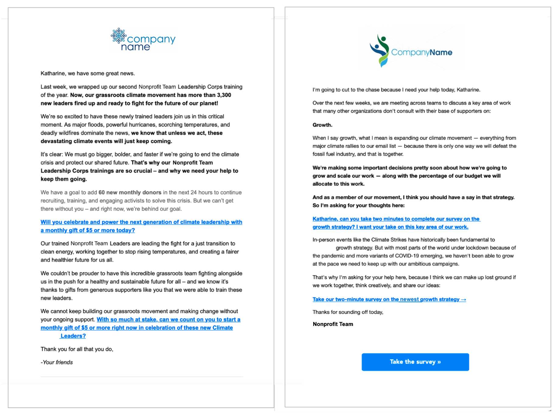
We won’t call anyone out here by name (identifying details have been edited out)... but we received the above emails on the same day, hours apart, from different organizations... and they are almost identical, down to the colors and fonts.
In addition to adding to a sea of email noise, and killing the chance anyone has to capture someone's attention, it also becomes hard for supporters to prioritize requests or find anything again if one email looks like all the rest. Templates can be awesome. These formats are reused because they work. But there is a better way.
Use The Templates and Make Them Your Own
What can an organization sending HTML emails, saving time and effort with templates, do to improve them? Upgrade the designs with these fixes that almost anyone can do.
Small changes make a difference. Branding is a thing for nonprofits too. It helps to create a visual “voice” an organization speaks in that is its own. Brand elements (colors, icons, fonts, images) are a great way to make an email “speak” in that specific, trusted voice.
Instead of scrapping the basic sections of a template that can and do work to engage individuals, take a moment to make them unique. Organizations that take time to customize templates and then reuse them save effort in the long run. Here are our top fixes to go from standard, below, to stands out --- at the end of the page. 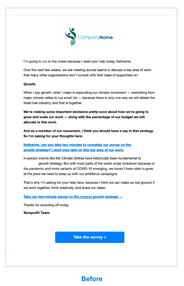
6 Nonprofit Email Design Fixes
1. Change the default hyperlink text to your own unique color
Bright hyperlink blue was useful to make something known as a link when the internet was new. It still can be, but today the overuse in the same way across so many emails makes it seem standard to the point of having lost any meaning at all. Consider changing this hyperlink color to something unique to your organization, or not hyperlinking a whole sentence at the end of a message like every other email does. 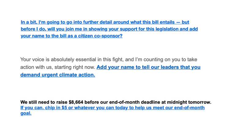 The examples above are once again each from completely different organizations. Donors want to feel connected to a specific mission, a group, a tribe, a community. It can strip the conversation of any possible authentic connection to be this generic. Choosing a bright color is still a helpful call out to let people know where to click. Match a button color if you’re going to use one and it will continue to read as a link.
2. Change section colors
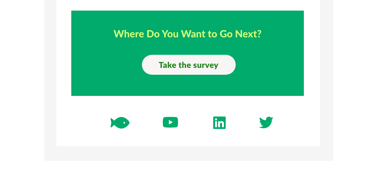
In line with customizing text, adding some careful color can help a section stand out. It is possible to go overboard with color, but when used right, it will read well and improve the overall look. Fortunately or unfortunately, look matters. Add a highlight banner in a branded color at the top, create a simple donate section in that color at the end, change the footer or the social links: a little color can go a long way. Pick a palette and use it.
3. Make the buttons your own
If you’re working with a basic template you may not be able to change this one too much, but we’re adding it here. It is possible to tweak these to a different enough style so they read as your own. Go greater in the width, change edges to an outline, increase your text size. Ask a dev or designer to help with this if you have access to them as a resource. Choose a format and then switch it up slightly in that style: think one button color for donation requests and another for petitions.


5. Connect with images or icons
Most templates have a place to add a picture. It might seem obvious, but the impact can also be overlooked. Images are still a great way to highlight recent work, cool events, something unique to your mission. If pictures don’t work, an icon or graphic can be a great alternative.
A recent picture of something that relates to the work happening or a graphic will make it seem more like a team of humans are behind the message instead of an automated bot. For those without dedicated design help, earnest and authentic less refined graphics can still be great. Canva.com is a good place to go if you haven't checked it out already. Using your own photos, either from a hired photographer, employees, or supporters is preferable, and today there are many free stock photo sites and photos offered under creative commons licenses that can be used. 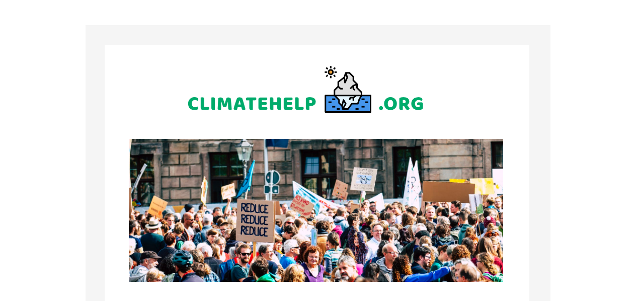
6. Change the text size or style and (and then check it for mobile)
Try changing the default message size in a message. Do a one-time blast with a bigger header and less little text. Try bumping the size bigger than you might think would be ok. If you’re stuck with default text, put text in an image. If you use a template you trust it may be less important to check the size comes through correctly on mobile, but this is still a good idea. See the larger text in the example below, above the survey button.

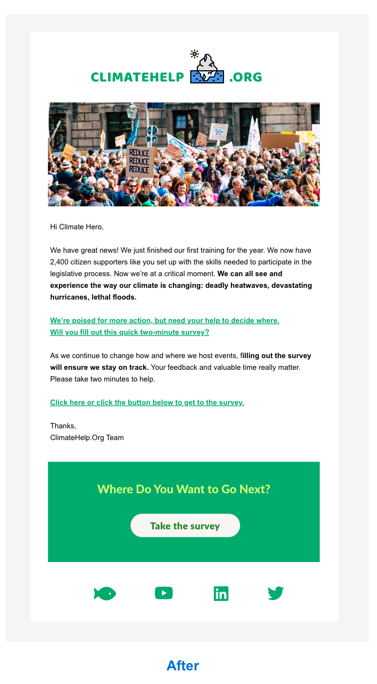
Those are our top suggestions for how to improve nonprofit emails, especially those built from templates. What are some of your ideas for ways to help your own organization or others have greater impact with email? Let me know in the Salesforce Trailblazer Community or chat with me on Twitter @ktatwd.
