Lightning Page Tips for a Better User Experience
The introduction of the Lightning Experience for Salesforce (LEX) has provided many tools that can be used to make Salesforce an even more powerful system. There’s no doubt that there were growing pains and many features were missing in its early days, but you must admit that over time many of the gaps were filled and the platform is now capable of things never before imagined.
This post is designed to not only provide tips and best practices, but also to open up your imagination for new ideas. I’m sure you will agree that the community has embraced LEX and in turn spurred your thinking of more ways to use the platform and tools to get the job done better, quicker, and more efficiently.
The Lightning Page Basics
Lightning pages should maintain a uniform look and feel as much as possible to ensure that end users can quickly learn how to locate and use them, and in some cases how they can make them their own with customized options.
Well-thought-out pages will increase adoption and efficiency. Having a clean, organized and well-documented org will go a long way toward maintaining your sanity as well. Here are a few things you will want to do.

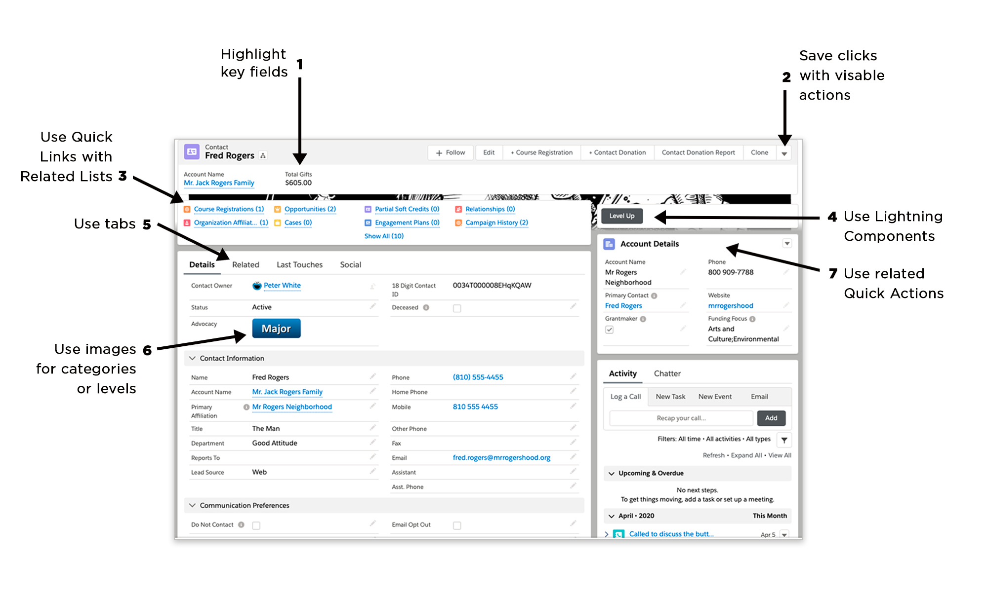
1. Only include key fields in the Highlights Panel and be consistent across objects. Show the record name first, maintain the same order for email, phone, and address fields.
2. Increase the number of visible buttons so that users won’t always have to click the down arrow. Needless to say, test with different browsers and sizes to ensure that the name is not covered.
3. Add the Related List Quick Links to your pages. You can also hide the header for a cleaner look.
4. For key buttons that run automated flows or processes, you can employ Lightning page components that can call out the process and even increase functionality such as returning the user back to the same page. You should regularly check the Unofficial SF pages to get ideas for ways to use components. Shown in the screen image is the Quick Action button component.
5. Using tabs can improve readability and even indicate a left-to-right process flow much like the Path feature. This helps the user by placing digestible chunks of information where it can be readily located.
6. For visual people like me, a well-placed image works wonders to call attention to important detail.
7. Use related Quick Action layouts to call out specific fields from the record itself or even a related record. More on this below.
Quick Actions Are Your Best Friend
How often are you faced with the challenge of displaying specific related object fields or even asked to dynamically “pop” certain fields or sections?
Oftentimes we can fulfill the requirement by creating related formula fields or even using the Dynamic Visibility feature in page components.
We also know and hope that dependent page layouts will be delivered in the Winter ‘21 release, but what to do in the meantime? Here’s a quick and easy way to meet the challenge.
This is not my idea but instead it arose from the Salesforce Community for which I am extremely grateful.
Quick Tutorial
For this quick tutorial, I will break out the NPSP Donation Rollup fields into their own component. Please note that this can be done with other fields and objects as well.
-
Go to Setup > Object Manager > Account > Page Layouts
-
Choose the assigned Household page layout
-
Make note of fields you want to move to their own component, i.e. fields within the Donation Information, Donation Totals sections. You can remove the fields from the layout now or return and remove them later.
-
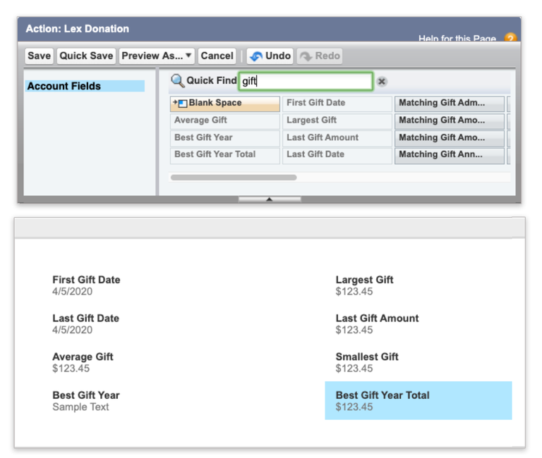
While still on the Account object, go to Buttons > Links & Actions and click “New Action”
-
Give the action a name you can easily recall and choose “Update a Record,” then input a description. I usually begin the name with “LEX"
-
Save the Action and the Action “Edit Page Layout” window will open
-
Remove any fields you don't want to display, along with all the fields noted from the Donation Information and Donation Totals sections, and place them in a logical order

-
Click “Save” and when a warning alerts you that some “required” fields are not included on the layout, click “Yes”
-
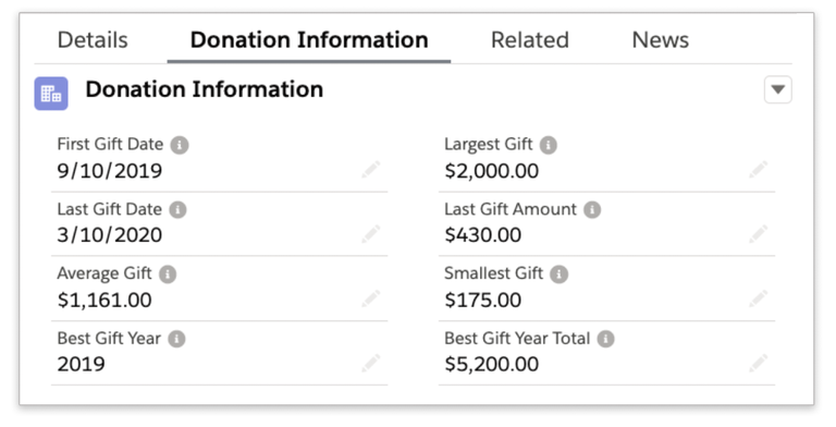
Decide how and where to place the fields component you just created on the Account Lightning page. You can create new tabs and place them there, or any other place on the page.
-
Go to a Household Account record, click the gear icon and select “Edit Page” to open the Lightning App Builder
-
If you have decided on a new tab, go ahead and create the tab and name it accordingly
-
Grab the “Related Record” component on the left-hand side and drag it wherever you decide the fields should appear, either on a tab or not
-
Update the component properties on the right side of the page
-
Enter an applicable Header Label
-
Set the Lookup Field to “Use This Account” and choose the action you created for the “Update Action." I also like to remove the “Create Action” here
-
Save the page and voila, check out your creation!

This is a quick and easy solution and remember, you can also use the same technique for any “Related Record” - you simply create the Quick Action on the related object.
How do you organize Lightning Pages? Do you have a standard template that’s used across objects? What are some other things you have done to enhance the user experience? Please feel free to reach out in the Success Community, or to me directly via Twitter at @sfdcclicks.
