Building Trust with Your Nonprofit Website
With over a million nonprofit organizations in the United States, creating a unique space for your organization in the digital realm is of utmost importance. In many instances, your homepage may be your first impression with a potential donor, volunteer, or future programmatic partner. How do they know they can trust your organization based on your digital presence?
Users land on your site in a number of ways—via social posts, newsletters, random searches —what do they expect when they arrive on your homepage? Users these days are savvy; they are used to quick transactions and have come to expect a smooth and thoughtful user experience from a small, short-staffed nonprofit the same way they expect one from a large, conglomerate ecommerce site. How do you cut through the clutter in order to showcase your organization's vision while simultaneously using site elements to build trust with future users?
What makes an organization trustworthy online?
The Homepage
Your homepage is a critical part of your overall digital strategy. Say it again! Your homepage is a critical part of your overall digital strategy. Use this prime piece of digital real estate to your advantage. If your marketing calendar doesn’t include plans to refresh your homepage with updates, new content, and Calls to Action (CTAs), add it.
Your homepage provides essential details to potential donors, volunteers, and users. You don’t need to overwhelm them with pop-ups, animations, or all the bells and whistles available to mankind—you just need to make sure you get three things clear to your users:
- Make sure you have included straightforward information about your organization’s mission and impact. This is not the time to wax poetic—keep it short, concise and then link to your “About” section where you can expand on the history of your organization.
- Do you take donations? If so, how do you use donations? Allow your content to briefly tell the story of how you plan to use their donation. This can be done in a number of creative ways— think infographics, photographs, and short videos—any of these mediums can get the point across. A direct plan for their donations will signal to a potential donor that their money will be used properly and with integrity. With that said...
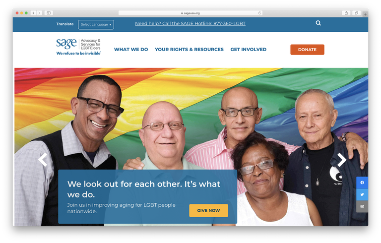
- Make it easy to donate. Don’t hide your donate page in hyperlinks throughout the body copy of your page—make it obvious. A large button or CTA is critical—do not make it hard for people to give your organization funding.

Donation button is prominent and easy to spot.
Partners & Endorsements
Does your organization partner with other nonprofits or foundations? Do you have sponsors or endorsements from well-known brands or figures in the community? If so, featuring their involvement on your site will help bolster the trust users have in your organization, which will potentially lead to a higher donation rate in the long run.
Find a way to organically work these partners into your website, specifically your homepage. If you recently had a brand sponsor an event—think about how you could bring that content to the forefront of your site.
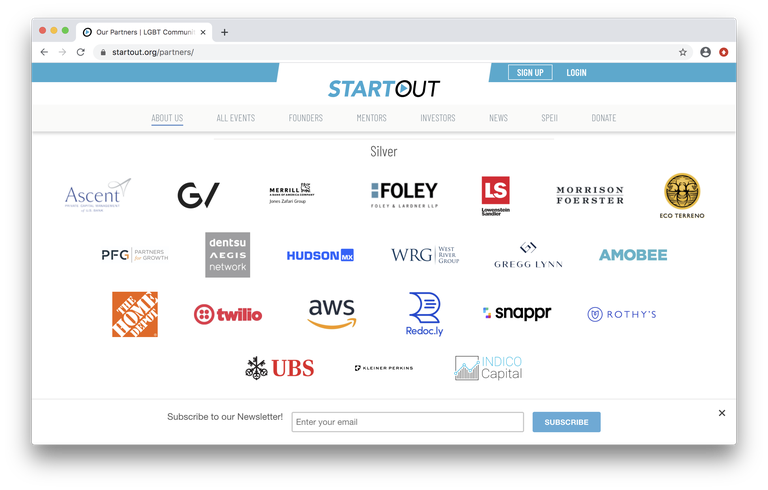
You could link to a blog post written about the event from your homepage, or create a module at the bottom of your homepage to showcase the logos of all sponsors—either way, this is an opportunity to signal to your users that you can be trusted through the partnerships you have cultivated.
Example of using partners to showcase your trustworthiness
Visual Design
Decisions on the web are made within seconds. Users will arrive on a site and bounce within moments if they find something else to explore. Think about the last time you were on an organization’s website and had a snap judgment—were you met with a huge block of text or a particularly persistent popup? Or was their page full of broken links? Was it not mobile responsive? Did their images load?
All of these elements build trust between your organization and the user. An organized layout and strong visual design will always be considered more trustworthy over a clutter-filled website. If you are an organization with a number of chapters across the country, it will be beneficial to make sure your affiliation sites match the look and feel of the main site. When the visual design isn’t consistent across affiliate sites and pages, users may assume they have clicked away from your organization
Make Your Copy Work For You
Have you ever visited an organization's website and tried to figure out exactly what they do and how they do it? Did it take you more than 30 seconds to find that information? Your potential donors and prospects will appreciate it when your initiatives and programs are clearly explained and displayed.
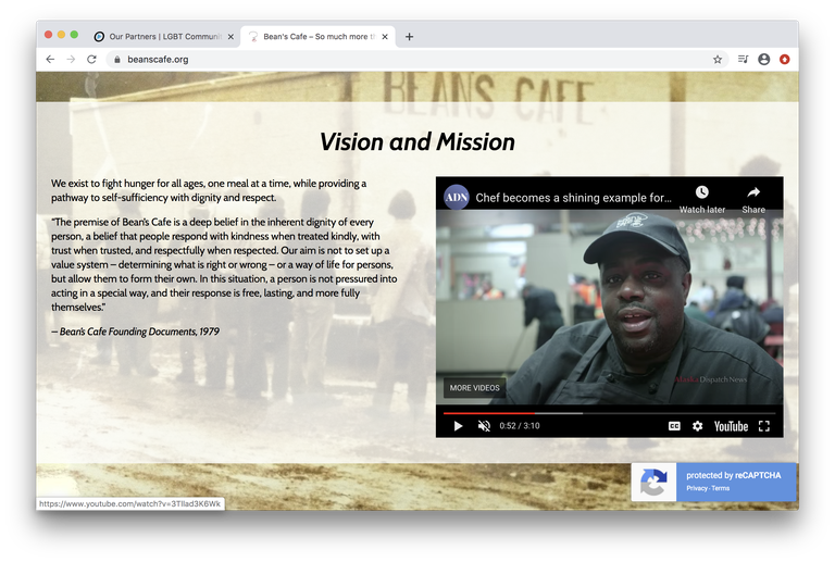
Avoid using too much jargon, or too many acronyms. They can quickly overwhelm your audience. Use easy-to-understand language and don’t forget that bullet points are your best friend. Your copy should tell your story while making it clear what organization does and why.
Clear and concise, Bean’s Cafe explains their vision.
At the end of the day, you’ll need to find ways to merge your organization’s passion for its mission with tried and true design elements in order to provide your users with the right-sized user experience. Focusing on the low cost, specific elements we’ve covered today can easily bolster the level of trust a new user will on your site.
What do you look for in a trustworthy site? Let’s talk about it. Leave a note in the Salesforce Trailblazer Community or chat with me on Twitter @Tamara_Buran.


