Redesigning the Arkus Website
Why redesign our website?
Every design project is driven by a why, and it’s a good idea to understand yours at the start.
Why does Arkus have a site in the first place, and what does it need to do? Arkus is an agile consulting agency helping people use Salesforce to do good work in the best way possible. The first site was launched on Plone in 2008, with a few pages about the founding team, services, clients, and a blog (you’re reading that right now) where Salesforce how-tos and episodes of our CloudFocus Weekly podcast could be shared.
As Arkus grew over the next 10 years, the site filled up with case studies, blog posts, and pages for the free Salesforce apps we built. The internet changed too, and websites went from book-like click-throughs to fewer, longer scrolling pages, as people moved from desktops to mobile. By 2017, a streamlining of the Arkus website was needed.
How did we make it happen?
After understanding the why and desired outcome, the next step was to identify what content and resources there were to work with. It was important to keep links active to posts but modernize the look of each. This made a new template and migration to Plone 5.1 the way to go. The majority of the content would remain untouched, with the exception of a few pared down main pages.
I came onto this project as a freelance graphic designer and joined the team full-time as the project progressed. Looking at the content and ultimate goal, in the beginning, made graphic needs clear. A Plone developer would do the upgrade and migrate, while I’d do the rest of the art-creating and copy-writing with input from the Arkus team.
If you’re facing a similar design, consider what separates you from your finished product. Can you write copy, build graphics, and edit code? Can you prototype the design yourself, or do you need a designer? Make an actual list and note what help you’ll need to fill in the gaps.
Before getting to visuals, it’s also critical to understand the spirit of your company. Branding exercises are a great way to do this.
We asked ourselves, what three words define this company? A closer look at the Arkus mission revealed three principles underlying everything: a commitment to working agile, using time productively, and staying proficient in the tools used. That made it possible to distill down to agility, productivity, and proficiency. It's our "app".
So what will the website look like?
For Arkus, agile and lean meant a website with minimal colors, sans-serif typefaces, and icons instead of photographs. Icons are everywhere online and for good reason.
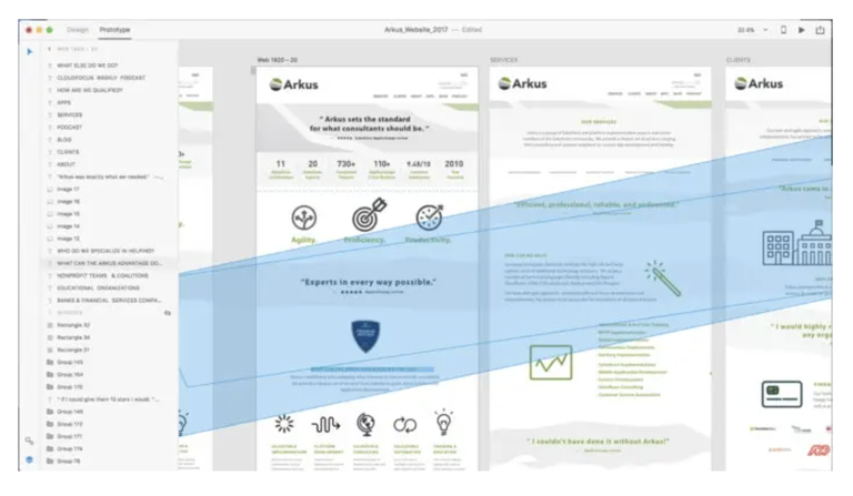
Your brain processes visuals 60,000 times more quickly than words. Access to Adobe Creative Cloud, including Photoshop and Illustrator, made it possible to build several custom sets of icons. The main prototypes of the pages were built in Adobe XD. This powerful software was new to me, and I took a big chance building all the drafts of the Arkus site with it.
You can read a bit more about how this went down and see earlier versions of the new homepage in this story on the XD blog. The main takeaway is that XD is an awesome tool and highly recommended.
A few weeks of distilling down content and drawing icons brought the site together, and XD made sharing proofs a breeze via PDF and links. The project progressed iteratively, just as Arkus’ Salesforce consulting and development projects do. This meant sharing versions and getting feedback on them earlier in the process and adjusting from there. Once the design had been settled, it was time for development.
Taking it from prototype to published
For the Arkus site, I had the help of the superb and highly skilled Plone experts at Quintagroup. XD has exceptional built-in functionality for creating libraries and a solid feature that allows you to export specs for developers too. The two combined meant a month or so later the template was built and it was time to test it on the developer’s server. Some emails, Skype calls, edits, and GoTo Meetings later, and the site was ready to launch.


What’s next and what do you think?
The new Arkus site was launched last week, and I’d love to hear what you think. Had you been here before and are as excited as everyone at Arkus is that it’s gotten an upgrade? Is it all new to you and you notice anything we may have overlooked? Have you ever used Plone or XD or been through your own redesign?
Leave us a comment on the Salesforce Success Community or send your thoughts to me directly @ktatwd.
